
How to Help Your Designer Create the Best Book Cover: An Interview with Page Two Art Director Peter Cocking

For a lot of authors, seeing their book cover is one of the most exciting parts of the process. In a dream scenario, your designer delivers your cover and you absolutely love it. More often, you see it, are unsure about it, and want the designer to make some changes. Maybe you even recoil from it.
It’s understandable if you have a strong reaction to it. After all, you’ve spent months writing your manuscript, and after all that time in your head, it can be jarring to see someone else’s interpretation of your work. But a skilled book designer will work with you to create a cover that balances your vision, the needs of the marketplace (after all, a cover is a sales tool), and aesthetics.
Peter Cocking is Page Two’s art director. We spoke with him about the process of working with authors on their book covers.
What are the multiple needs that you juggle when you create a book cover?
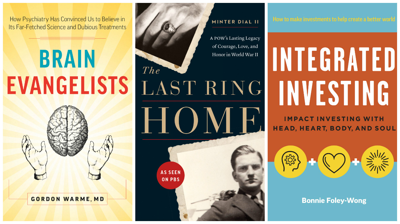
Job one is to create something that communicates a sense of the book. In most non-fiction books, this can be quite literal – one wants to give potential readers an idea of what the book is about – while in fiction the goal is usually to be more allusive, to suggest something of the mood or tone of the text. The design has to be something that a consumer can “read” very quickly – in a glance, really – so clarity is crucial. As a designer, you have to do the hard work; you have to make it easy for your audience. You have to attract them, interest them, draw them in. Make them want to know more; ideally, make them want to buy the book.
You also have to create an object that is aesthetically pleasing – that someone will want to own, to carry with them, to leave on their coffee table. A book cover is kind of an advertisement for the book, but it’s different from a standard ad: it’s an ad that you want to own, to take home.
The fact that most books are now purchased online – and that the book’s cover will likely be used on both a print book and an ebook – is important to remember, too. The ideal cover is interesting and attractive when viewed up close, while holding the book, and when viewed online, at two or three inches high. It needs to communicate, and be eye-catching, when viewed large and small, in print or on-screen.
When you’re working with an author on their cover, what kind of feedback is most helpful to the process?
Generally I prefer authors to take a holistic view of the cover; towards viewing the design as a whole, and evaluating whether it is (or isn’t) communicating what it should be communicating, and whether it’s appropriate for the content and the audience.
Generally it works better if an author tries to articulate the problems, and lets me attempt the solutions. So rather than saying “make this word blue,” it’s more helpful to hear an author say “I can’t read the tagline,” or “the title should be stronger, and should pop out more,” or “I don’t think that image quite communicates the sense of the book.” Or even just “I don’t like it.”
How useful is it for authors to send mockups of the cover they envision?
Frankly, it’s not useful at all – it would be akin to me revising their text. What is useful is to see the kind of covers that an author likes and responses to –regardless of the category. It really helps to get a sense of an author’s taste and sensibilities. It’s also helpful to see a selection of covers from books that an author sees as their competition. It’s nice to know that an author has been looking at what’s out there in the marketplace, so they have a sense of the look and feel of their category.
Does it ever happen that you and an author can’t come to an agreement on a cover? And how do you know you’ve reached that point?
I’ve never really had that happen – at least not to the sense that it’s become a unsolvable problem. Ultimately, I’m in the service business, so if an author really doesn’t like the any of the designs that I’ve proposed, then I’ll change direction, and search for an approach that meets the author’s approval. Sometimes this results in a cover that, in my opinion, doesn’t work as well as it could have – but other times it yields a better result than anything I might have come up with on my own. I try not to be too precious about it.
 Peter Cocking is Page Two’s art director. He is also the creative director of PeterCo Design and an adjunct professor of typography at Emily Carr University. Considered one of Canada’s finest publication designers, he has received over fifty awards for his work, and has lectured on design and typography throughout Canada and in the U.S. His practice has been wide, from books to annual reports, packaging to corporate identity programs, newspapers, magazines, and websites. He is the former art director of D&M Publishers, leading the company to more design awards than any other Canadian publisher.